


Austin’s new logo, a wavy blue and green “A,” has ignited a firestorm of criticism for its $1.1 million price tag. City officials unveiled the design on Sept. 4, claiming it unifies over 300 disparate logos used across departments. But the backlash suggests taxpayers see it as a flashy distraction from real issues like public safety.
The redesign, approved in 2018 to create a consistent city brand, cost $1,117,558, including $200,000 for design and $640,000 for vendors. Austin officials unveiled a wavy purple and green “A” meant to reflect the city’s hills, rivers, and bridges. Critics, however, liken it to a math textbook logo or, worse, a “homeless tent.”
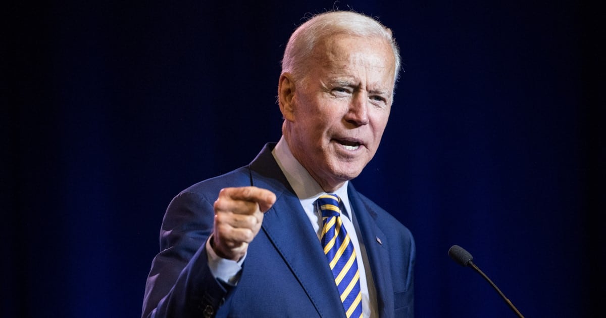
Rep. Chip Roy, R-Texas, didn’t mince words, blasting the project as a “woke-looking band emblem.” He argued Austin’s leaders are obsessing over symbolism while 911 calls go unanswered and crime spikes due to police budget cuts. His fiery critique on The Will Cain Show resonates with residents fed up with misplaced priorities.
City Manager T.C. Broadnax hailed the logo as a historic step toward unifying Austin’s services. “For the first time in Austin’s history, we will have a logo to represent the city services and unify us as one organization, one Austin,” he said. But unity feels hollow when the price tag could fund actual public safety improvements.
Jessica King, Austin’s Chief Communications Director, doubled down, claiming the logo’s colors echo the city’s “violet crown skies” and green parks. Her poetic spin doesn’t mask the fact that $115,000 went to public awareness campaigns for a design many residents already despise. The disconnect between city hall and taxpayers is glaring.
The logo, designed by DJ Stout of Pentagram, has been called “the ultimate design by committee.” Stout himself noted Austin’s reputation as a “little liberal island, politically.” That characterization might explain why the design feels more like a progressive art project than a practical city emblem.
Online, Austinites tore into the logo with savage wit. One resident called it “a bad biotech company’s rebranding,” while another sneered, “The new logo sucks. It looks like a homeless tent.” These aren’t just quips—they reflect genuine frustration with a city spending millions on aesthetics over substance.
Some residents, however, see merit in the design, praising its minimalist and modern look. “It’s definitely a modernization of the old one,” one supporter noted. Yet, even these defenders are drowned out by the chorus of critics who question the city’s fiscal priorities.
The original city seal, featuring a cross and lamp, is being phased out as part of this overhaul. For many, swapping a historic symbol for a wavy “A” feels like erasing tradition for a trendy, overpriced gimmick. The $1.1 million cost stings even more when basic services falter.
The rebrand rollout begins Oct. 1, 2025, starting with digital assets like the city’s website and social media. Physical assets, such as uniforms and vehicles, will transition gradually to “minimize impact on the City budget,” per a city press release. But skeptics wonder how a million-dollar logo minimizes anything.
Budget documents reveal the hefty breakdown: $200,000 for design, $640,000 for vendors, and $115,000 for public awareness. That’s a lot of cash for a logo that an Instagram user summed up with a single word: “Bruhhhh.” The public’s exasperation is palpable and justified.
Marketing professor Chris Aarons offered a measured take, noting that a logo’s value lies in what it comes to represent. “The Coca-Cola was just a script, but it’s a beautiful script,” he told KXAN. His point is fair, but Austin’s logo needs more than time—it needs public trust, which it’s already squandered.
Rep. Chip Roy’s critique cuts deeper, tying the rebrand to broader failures in governance. “We have people in Austin who don’t get their 911 calls answered,” he said, pointing to crime spikes after police budget cuts. Spending millions on a logo while safety suffers feels like a slap in the face to taxpayers.
The city’s 300-plus logos were indeed a mess, and a unified brand could streamline communication. But the timing and cost of this project, amid rising crime and strained services, make it a tough sell. Austinites deserve practical solutions, not a pricey new letterhead.
Neither the City of Austin nor Pentagram responded to Fox News Digital’s requests for comment, leaving critics’ voices to dominate the conversation. As the Oct. 1 rollout looms, the wavy “A” stands as a symbol not of unity, but of a city government out of touch with its people’s priorities.